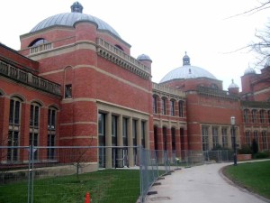
If you take a walk today through Chancellor’s Court in the heart of the University of Birmingham you will have to look hard to notice a brand new building in the old semi-circle of 1909 neo-Byzantine buildings.

The work has been skilfully executed, but was this a proper task for a modern architect who was trained to create buildings that speak of their own time, not that of one long gone?
The answer seems to be that it was what the client demanded and the architect duly obliged, a situation not unlike that in the nineteenth century when architects could turn their hand to Gothic or Classical by copying out historical drawings from published pattern books.
In this case it could not have been a choice between two styles each costing much the same. Buildings like those in Chancellor’s Court stopped being built because they were very labour-intensive and cost too much to build. Modern architecture was on the other hand austere, industrialised and cheap to build.
So how was it possible to buck the trend and put up a new building in 2012 just like one built a hundred years ago?
The answer has to be that a wealthy benefactor helped to foot the £16 million bill, in this case, Terry Bramall of Keepmoat. The result doesn’t seem to be at all controversial, whereas an uncompromising modern infill would almost certainly have enraged architectural historians and the public at large. It appears that if a building owner wants to avoid controversy in such a context it is better to match the new building as closely as possible to its historical surroundings.
The implications of this approach to sensitive sites are intriguing. At the University the old buildings at each side of the new building were identical in style and age, so the architect did not have to face a problem about which style to match. Perhaps this makes it an unusual if not unique piece of infill. Other infill sites are not so straightforward. Two cases come to mind. The car park in Centenary Square was sandwiched between the neo-classical Baskerville House and the Modernist REP Theatre. What style would have been appropriate here?
John Madin’s Central Library has been criticised for being too bulky and not ‘fitting in’ architecturally with the Town Hall and Council House but Argent’s proposal to replace it with bland commercial office blocks will face the same criticism. But what style would be appropriate? If money were no object, would Argent’s architects oblige by clothing them in a neo-classical Portland stone façade that matched the Town Hall or the Council House, or both, and which wasn’t any higher than either? This seems extremely unlikely on grounds of high capital cost and the loss of profitable floor space.
The alternative for architects in these situations is the one chosen by Mike Whitby and Francine Houben and there for all to see in Centenary Square. There was no way any self-respecting modern architect could have done a matching job here and the Council’s brief for a massive building put paid to any qualms about going above the neighbouring rooflines.
In the absence of a strong planning and urban design policy it seems that architects and their clients can do whatever they or their clients fancy, but there are welcome signs in the cases of the Central Fire Station and Paradise Circus that the Planning Committee and the Conservation Panel are no longer prepared to let them have things all their own way.